STRM
A Swift iOS streaming concept for browsing movies, viewing TV show details, exploring seasons and episodes, and playing content.
STRM
Discover movies and TV shows with a clean streaming experience.
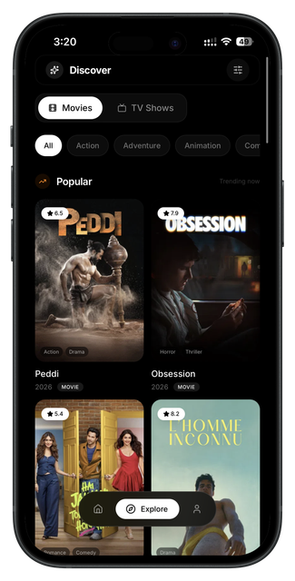
STRM is a streaming concept designed around discovery, browsing, and clean media presentation. The app focuses on helping users find something to watch through curated categories, detailed show pages, season and episode browsing, and a focused media player. Every screen is built to keep the content front and center.
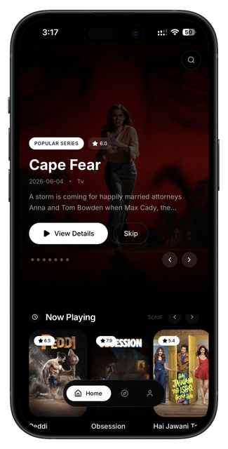
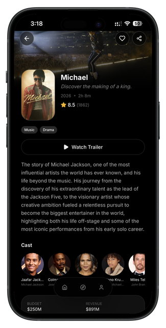
The idea was to build a streaming interface that prioritizes exploration and content clarity over complex menus and algorithmic clutter. The home screen surfaces trending titles and curated collections. The detail pages give users ratings, synopsis, cast information, and direct access to seasons or episodes without unnecessary navigation.
The user starts on a home screen with featured content, categories, and trending titles. They can open a movie or show detail page to view ratings, description, cast, and trailers. For TV shows, a dedicated screen lets them browse seasons and episodes. The player delivers a clean, minimal playback experience with simple controls.
The design uses a dark monochrome palette: black backgrounds, dark black card layers, grey accents and labels, white text for readability, and light grey surfaces for subtle contrast. The interface is intentionally grayscale so cover art, media, and content visuals stand out without competing with UI accents.
This concept was planned for Swift and SwiftUI using a horizontal scrolling hero section, category rows, content cards, detail pages with metadata, season and episode lists, and a custom player overlay. The design took around 4 days.
The flow is designed for discovery: browse the home feed, open a title for details, browse seasons and episodes, and play content in a clean viewer.
Product thinking
Problem
Streaming apps can feel overwhelming when the interface competes with the content instead of getting out of the way.
Solution
The solution is a dark, minimal browsing experience that highlights cover art and metadata while keeping navigation simple and direct.
Target user
Users who want to browse movies and TV shows, read descriptions and ratings, and watch content on mobile.
Key features
User flow diagram
Browse
Discover trending titles and curated categories.
Detail
View ratings, synopsis, cast, and trailers.
Seasons
Browse TV show seasons and episode lists.
Play
Watch content with a clean player interface.
App structure
Design summary
Home feed, content detail, season and episode browser, media player.
Dark monochrome palette, content-first layout, clear metadata hierarchy, and simple playback controls.
Minimal, dark, clean, focused, modern, and immersive.