Skyward
A Swift iOS flight booking concept for searching destinations, comparing fares, selecting seats, and tracking reservations.

Skyward
Find flights, compare fares, and travel with confidence.
Skyward is a flight booking concept designed around clarity, trust, and smooth trip planning. The app focuses on helping users search flights, compare fare options, pick seats, and track their reservations without friction. The interface stays clean and readable even when presenting complex fare and schedule information.
The main idea was to make flight booking feel calm and transparent instead of stressful. Most travel booking flows feel rushed and crowded because they show too many options, rules, alerts, and upsells on one screen. Skyward separates each decision point — search, fare comparison, seat selection, and trip details — so the user never feels overwhelmed.
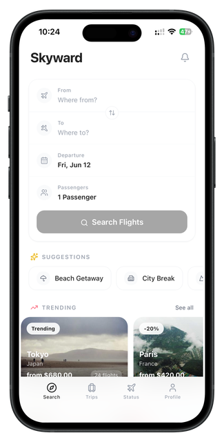
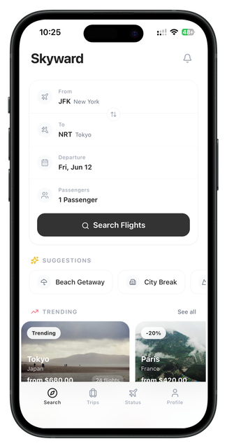
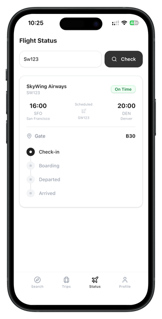
The user begins on a search screen with destination fields, date inputs, and passenger count. After searching, they see a fare comparison list showing airlines, prices, durations, and stops. Selecting a fare opens the booking flow where they choose seats and review the full trip before confirming. A dedicated trips screen shows upcoming and past reservations with status and details.
The design uses a clean monochrome base: dark surfaces for the main app chrome, white for content areas, soft smoke gray for dividers and cards, light yellow accents for highlights, branding, and call-to-action buttons, and light green for positive indicators like available seats and confirmed statuses. The layout is spacious with clear typography hierarchy and rounded cards.
This concept was planned for Swift and SwiftUI using destination search forms, fare comparison cards, date picker components, seat maps, booking summary panels, and trip status cards. The design took around 3–4 days.
The flow is simple: search for flights, compare fare options, choose seats and extras, confirm booking, then track your trip.
Product thinking
Problem
Flight booking apps can be stressful when search results, fare rules, upsells, and booking steps are all crowded into a single screen.
Solution
The solution is a separated step-by-step booking flow that lets users focus on one decision at a time with clear information at each stage.
Target user
Travelers who want to search flights, compare prices, select seats, and manage their bookings in a simple and calm mobile interface.
Key features
User flow diagram
Search
Enter destination, dates, and passengers.
Compare
Review fares, airlines, and durations.
Book
Select seats and confirm the trip.
Track
View upcoming and past reservations.
App structure
Design summary
Flight search, fare comparison, booking and seat selection, trip tracking.
Clear search inputs, fare comparison cards, simple seat selection, and readable trip status.
Calm, clean, trustworthy, modern, spacious, and easy to use.