Scoffly
A Swift iOS food ordering concept for browsing restaurants, viewing menus, and customizing meals.


Scoffly
Food, groceries, and restaurants in one friendly app.
Scoffly is a food delivery concept built around quick browsing, warm visuals, and a friendly ordering experience. The app combines restaurant discovery, grocery-style categories, promotional areas, restaurant detail pages, and item customization into one simple mobile flow.
The concept is based on the idea that food apps should feel fast but still enjoyable. The home screen gives users several ways to start: categories, deals, favorite restaurants, and popular food sections. This makes the app feel useful for both planned meals and quick cravings.
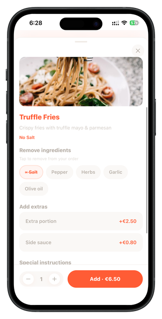
The user can open the home screen, browse categories, pick a restaurant, view restaurant information, look through menu items, and customize a dish before adding it to the order. The customization screen focuses on clear add-ons, removals, quantity changes, and a fixed action button.
The design uses a warm orange-red primary color, cream backgrounds, yellow highlights, soft green category tiles, rounded food cards, and bold food imagery. The interface is made to feel playful and appetizing while still being structured and readable.
This concept was planned for Swift and SwiftUI using reusable category cards, restaurant cards, menu item components, customization chips, quantity controls, and fixed checkout actions. The design took around 2–3 days.
The flow is designed to be fast: open the home screen, choose a restaurant, view menu details, customize a meal, and prepare the order.
Product thinking
Problem
Food ordering apps can become cluttered when categories, offers, restaurants, and item options are all shown without clear hierarchy.
Solution
The solution is a friendly home layout with strong sections and a short ordering path that keeps the main action visible.
Target user
Users who want fast food delivery, restaurant browsing, meal customization, and simple add-to-cart actions.
Key features
User flow diagram
Home
Browse categories, deals, and restaurants.
Restaurant
Open restaurant details and menu sections.
Customize
Choose add-ons, removals, and quantity.
Order
Add item and prepare checkout.
App structure
Design summary
Food home, restaurant detail, item customization.
Food photography, fast choices, warm colors, simple customization, and clear order actions.
Colorful, fast, friendly, warm, playful, and easy.